Kerning is more than just a word you might have heard earlier. In graphic design, it’s the gap between two characters, most importantly, letters in a word. Best designers change the spacing between the letters to make your word visually pleasing. There is no correct mathematical formula for best kerning, and it is up to the designer’s eye. For instance, we have created in Adobe Illustrator, and you will view the difference in the word BOAT.
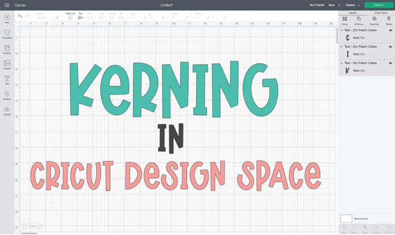
Letters with diagonal sides can be the toughest to kern, like A. The negative room between the letter A and the O and the gap between the T and the A is large; it makes the gaping room between the letters & makes the ending of the word BOAT feel a little untethered.
For the second example, we used Illustrator’s kerning feature to set the spacing between each letter. Then the letter A tucks below the O a bit better, and the letter T is over a diagonal stroke of the letter A. The word looks more grounded and entire than it did earlier kerning.
Also Read: How to Use Flatten Tool in Cricut Design Space
Difference Between Letter Spacing and Kerning
This is more like a letter gaping. But letter spacing is the overall spacing of the word to make it dense when kerning sets the spacing between particular letters or characters to make it visually pleasing. Let’s take an example of general and increased letter spacing (BEAUTIFUL and B E A U T I F U L).
But if you pay more attention to the first word, beautiful, it would use some kerning. B and E are far apart, so A would be tucked below the letter U a bit better.
What are Cricut Kerning and Kerned Fonts
Now let’s find out about Cricut kerning. When Cricut first announced this feature, many crafters thought they would get control over the gaping between letters so they could kern things for visually pleasing. For instance, kerning looks like a size-adjusting tool in Adobe Illustrator, where users can adjust the spacing in small increments.
Rather, you will get Kerned Fonts in the Cricut Design Space software. There needs to be granular level management. Kerning applies to Cricut fonts and not system fonts. They should have launched kerned Cricut fonts before Cricut featured notoriously poor spacing. You would write a word into Design Space and choose a font it will look like; it is the opposite of the word magnificent. It is magnificent if you will.
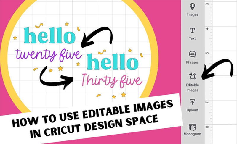
Also Read: How to Use Editable Images in Cricut Design Space
This is because Design Space could read every letter as an individual picture, and the software won’t overlap them. The fix before kerned fonts was to space and letters them separately.
But with the introduction of kerned fonts in the Cricut Design Space program, Cricut has provided users with a better beginning point. Primarily instead of the separate kerning, they have fixed the zero-overlap error on some of the fonts and named them kerned fonts.
To filter using the kerned fonts, you can choose the Only Kerned Fonts option in the Font Toolbar. Tick the box as the Cricut design team kernels the filter by fonts.
We have picked the Alyssa Stencil Script (a kerned font) in this example. You will see that the gap between the letters is better than in the above example. Writing and cutting the project is super easy. Contrary to true kerning, Cricut has fixed the letter gaping on specific fonts.
Also Read: How to Use the Cricut Monogram Maker in Design Space
Instructions for Kerning in Cricut Design Space
To utilize the Kerned fonts, you can go through the procedure underneath.
- First, you must launch the Cricut Design Space software on your desired device.
- Next, choose the Text Tool or current text box and choose the font dropdown menu.
- By default, fonts with kerning filter the font list. Browse to find the desired font and tap on it. The kerned text will be visible on the Cricut Canvas.
- Note: When users utilize the Text Tool and launch the font list, the kerned fonts filter at the top right will be applicable by default. With that filter, fonts visible in this menu are fonts with kerning.
Kerning Suggestions for Improving the Typography
In typography, kerning is an adjustment of the gap between two letters. Also, It is usual to ignore when you are reaching the end of the grueling deadline.
Look After the Tracking and Leading Before Kerning
Tracking is an overall gaping between different letters. Leading is a vertical gap between different lines. It is essential to make the required adjustments to your tracking and leading first, as kerning can undo the stability in the kerning adjustments you have already initiated.
Do Not Let the Font Software Kern
Regarding logotypes and headlines, you should kern the characters instead of depending on the default gaping. Every typeface will need to set the kerning differently for all.
Graphics programs feature auto-kerning tools such as Optical kerning and the default Metric kerning, which adjust the gaping between characters depending on their shapes. Although, kerning will provide you control.
To kern your kind, you can use the Characters Panel in the software, which will look the same whether you are working in Illustrator, Photoshop, or InDesign. Begin by launching the Characters panel. Then, double-tap on your mouse between the letters you wish to kern. After that, move to the Character panel to change the number in the kerning tool.
Also Read: How to Use the Cricut Foil Transfer Tool
Make Equal Perceived Space Between Characters
Kerning is not the mathematically equal space; it is the perceived equal space between characters according to our eye when the general kerning technique is sand filling the spaces and trying to create the volumes of sand equal.
While kerning, ensure to zoom a little on your kind, or the gaping will look deceptively bigger than the final result.
Kern the Desired Kind Upside Down
Doing this assists users see their kind as a group of equally gapped shapes without losing the meaning of the words.
Final Verdict
Kerning is spacing between characters or letters in the printed text. In the Cricut Design Space software, Cricut has optimized for plenty of Cricut fonts and system fonts, so the gaping between characters or letters is automatically natural. The above comprehensive post on Kerning helps you familiarize yourself with its features and uses.